
Xamawin • zam-ah win | noun
A quick, easy to implement enhancement for a Xamarin App that improves performance, appearance, or functionality
Update September 2020: Radio Buttons are now included as a standard Xamarin.Forms control. You can read the documentation on using them here. For older versions of Xamarin.Forms, find my original post below:
While I generally try to steer design and UX of mobile apps in the direction of native controls, sometimes the out of the box solution just won’t cut it. The Picker is a good example: while you might be able to get away with one or two Picker’s on screen at a time, constantly opening and closing drawers on, say, a settings page, or selection form can be cumbersome and slow down your users. In instances like these, we can turn to a staple of the web: grouped radio buttons.
Aside: It’s important to note that the concept of “radio buttons” exist natively for Android, but not for iOS, which usually relies on a UITableView (similar to the implementation we are about to see), or a series of switches. If you are only targeting a single platform or have a strong affinity towards the Google/Apple design patterns, you may want to explore a different layout approach.
While the switch control, having a binary on/off state built in, may be a tempting offering to duplicate the functionality of a radio button, I found the easiest approach is to use a ListView. Consider the following markup:
A few things to note on the markup here: Having two separate labels to represent the “checked” state is a little crude. Instead, a label (or image, depending on how you want to represent checked states) bound instead to the IsSelected property via a converter or behavior would be more flexible and help simplify our layout. Also note that we are borrowing liberally from a James Monetmagno post (a favorite of mine!) on Grouping to expose some additional functionality of the ListView.
The IsSelected property is an observable property on a custom model that represents each element in the list:
This file contains hidden or bidirectional Unicode text that may be interpreted or compiled differently than what appears below. To review, open the file in an editor that reveals hidden Unicode characters.
Learn more about bidirectional Unicode characters
| using System; | |
| using System.ComponentModel; | |
| using System.Runtime.CompilerServices; | |
| namespace samples.core.Models | |
| { | |
| public class RadioOption : INotifyPropertyChanged | |
| { | |
| public RadioCategory Category { get; } | |
| public string Title { get; } | |
| private bool _isSelected { get; set; } | |
| public bool IsSelected | |
| { | |
| get => _isSelected; | |
| set | |
| { | |
| if(value != _isSelected) | |
| { | |
| this._isSelected = value; | |
| NotifyPropertyChanged(); | |
| } | |
| } | |
| } | |
| public RadioOption(RadioCategory category, string title, bool isSelected = false) | |
| { | |
| this.Category = category; | |
| this.Title = title; | |
| this.IsSelected = isSelected; | |
| } | |
| public event PropertyChangedEventHandler PropertyChanged; | |
| // This method is called by the Set accessor of each property. | |
| // The CallerMemberName attribute that is applied to the optional propertyName | |
| // parameter causes the property name of the caller to be substituted as an argument. | |
| private void NotifyPropertyChanged([CallerMemberName] String propertyName = "") | |
| { | |
| if (PropertyChanged != null) | |
| { | |
| PropertyChanged(this, new PropertyChangedEventArgs(propertyName)); | |
| } | |
| } | |
| } | |
| public enum RadioCategory | |
| { | |
| CategoryA, | |
| CategoryB, | |
| CategoryC, | |
| CategoryD | |
| } | |
| } |
We’ve manually implemented INotifyPropertyChanged here, but if you’re using an MVVM framework, you might get that functionality out of the box with less effort. Refer to BindableBase in Prism.Forms for reference.
Now, let’s take a look at the parts that make this radio group tick. First and foremost, we need to handle ItemTapped in our code behind.
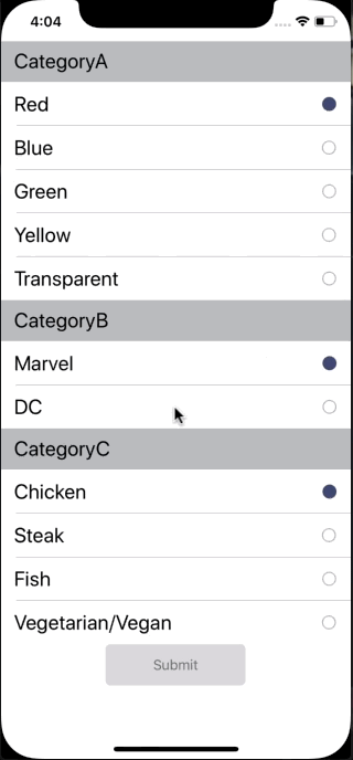
public void Handle_ItemTapped(object sender, ItemTappedEventArgs e) { var item = e.Item as RadioOption; if (item == null) return; // Somewhat inefficient way of ensuring only one item per group is // selected. You could also perform logic to toggle state (assuming // it is within reason to slect many per group. // // If we were using an MVVM framework, it would be smart to move this // logic to the ViewModel foreach (var group in RadioOptionsList) { if (group.Contains(item)) { foreach (var s in group.Where(x => x.IsSelected)) { s.IsSelected = false; } item.IsSelected = true; } } }This is where we are executing the logic to ensure only one item per group appears selected at a time. You can find the full code behind here. From here, we can run the solution and see our shiny new radio buttons in action:
You can check out the complete solution over on my GitHub. Cheers!
 I Write Code Sometimes
One thought on “XamaWIN – Cross-Platform Grouped Radio Buttons in Xamarin.Forms”
Comments are closed.