
I’ll admit – I’m not a huge fan of the picker control on iOS. As a developer, I find use-cases for the rolodex-like control few and far between and, as a user, I often find implementations to be clunky and inferior to other alternatives. Nonetheless, every now and again an occasion will arise where a UIPickerView makes sense; in this post, I’ll explore how to make one in a Xamarin.Forms project when your needs extend beyond the common DatePicker control.
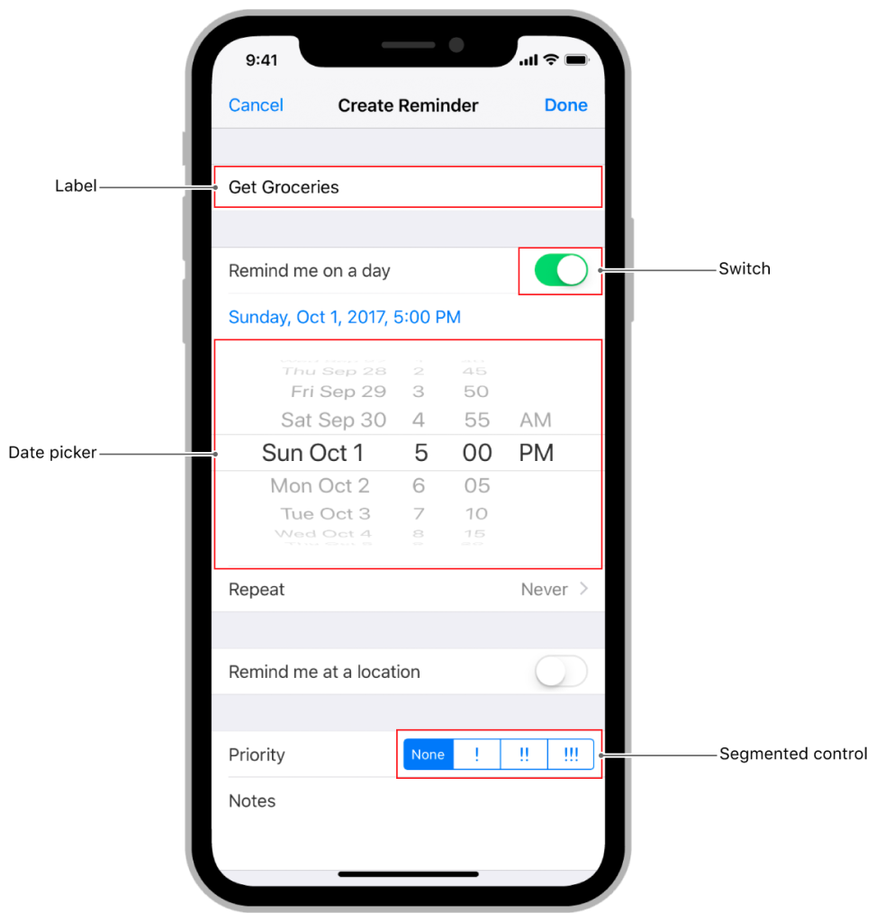
UIPickerView is commonly used for selecting dates and times
Motivation
Before we dive in, let’s discuss some cases where we might want to use a UIPickerView in a mobile app. As with the standard Date Picker, an ideal case is a tree list; in this instance, each node drives the contents on the children/next set of data presented. In the case of a DatePicker, your month selection for the first column would likely drive the day selection for another column (since months have a variable amount of days). But, since the DatePicker use case is already solved and available out of the box in Xamarin, let’s look an a custom Picker that leverages a unique tree of data we want to present to a user.
Making the Control
First, let’s get some boilerplate out of the way. What follows is pretty standard custom renderer content for Xamarin.Forms. In our shared project, make a proxy control that we’ll override with a platform-specific implementation later:
namespace samples.core.Controls
{
    public class MultiPickerControl : Xamarin.Forms.StackLayout
    {
        public MultiPickerControl()
        {
            // Just a placeholder
        }
    }
}
The renderer in our iOS project is fairly straightforward as well, merely adding an existing control to a new renderer.
[assembly: ExportRenderer(typeof(samples.core.Controls.MultiPickerControl), typeof(samples.iOS.Controls.Picker.MultiPickerRenderer))]
namespace samples.iOS.Controls.Picker
{
    public class MultiPickerRenderer : ViewRenderer
    {
        static UIPickerView pickerControl;
        static DemoModel pickerModel = new DemoModel(new UILabel());

        public MultiPickerRenderer()
        {
            pickerControl = new UIPickerView(
                new CGRect(
                    UIScreen.MainScreen.Bounds.X - UIScreen.MainScreen.Bounds.Width,
                    UIScreen.MainScreen.Bounds.Height - 230,
                    UIScreen.MainScreen.Bounds.Width,
                    180))
            {
                Model = pickerModel
            };
        }

        protected override void OnElementChanged(ElementChangedEventArgs<View> e)
        {
            base.OnElementChanged(e);

            if(Control != null)
            {
                Control.Add(pickerControl);
            }

            if(e.NewElement != null)
            {
                (e.NewElement as StackLayout).Children.Add(pickerControl);
            }
        }
    }
}
Next comes the interesting part; let’s create a new model in our iOS project that will drive the behavior we want from the UIPickerView. The next few sections follow pretty closely with the documentation, but we’ve made some edits to support he behavior we desire.
But first, let’s take a look at an example data set:
        public Dictionary<string, string[]> options = new Dictionary<string, string[]>()
        {
            { "America", new string[] { "Mexico", "USA" } },
            { "Europe", new string[] { "Germany", "France", "Italy"} },
            { "Asia", new string[] { "Korea", "Japan"} },
        };
First, we need to set the column count. In our case, we only want 2 columns, but (theoretically) you could extrapolate the logic we’re about to implement to as many columns as will fit on screen.
// This determines how many columns are rendered
public override nint GetComponentCount(UIPickerView pickerView) => 2;
Now, we have a few key overrides to implement; one to determine how many items are in each column and one to determine what text to show in each row.
        /// <summary>
        /// Determines the number of rows to render in a component
        /// </summary>
        public override nint GetRowsInComponent(UIPickerView pickerView, nint component)
        {
            if (component == 0)
                return options.Keys.Count;
            else
            {
                var driver = pickerView.SelectedRowInComponent(0);
                return options.Values.ElementAt((int)driver).Length;
            }
        }

        /// <summary>
        /// Gets the display value for a row in a component
        /// </summary>
        public override string GetTitle(UIPickerView pickerView, nint row, nint component)
        {
            if (component == 0)
                return options.Keys.ElementAt((int)row);
            else
            {
                var driver = pickerView.SelectedRowInComponent(0);
                return options.Values.ElementAt((int)driver).ElementAt((int)row);
            }
        }
At this point, if we were to test the control, the second column would not change based on the selection from the first. To achieve our desired behavior, we’ll need to modify the event that triggers on selection:
[Export("pickerView:didSelectRow:inComponent:")]
        public override void Selected(UIPickerView pickerView, nint row, nint component)
        {
            // Update the display for column 2 if the value of column 1 has changed
            if (component == 0)
            {
                pickerView.ReloadComponent(1);
                pickerView.Select(0, 1, false);
            }
        }
You can see the whole file in this gist for easy reference.
With all that out of the way, we’re ready to add our control to a page to be rendered. Below, I’ve highlighted two key lines where we reference our controls namespace and add the new control to the page
<?xml version="1.0" encoding="UTF-8"?>
<ContentPage xmlns="http://xamarin.com/schemas/2014/forms"
             xmlns:x="http://schemas.microsoft.com/winfx/2009/xaml"
             xmlns:controls="clr-namespace:samples.core.Controls;assembly=samples.core"
             x:Class="samples.core.Views.EntryMoveNextView"
             xmlns:ctrl="clr-namespace:samples.core.Controls;assembly=samples.core">
    <ContentPage.Content>
        <StackLayout Padding="15,25">
            <controls:MultiPickerControl x:Name="MultiPicker"/>
        </StackLayout>
    </ContentPage.Content>
</ContentPage>
That should do it! Once we launch the project on a device or iOS Simulator we should see a control that looks like this:
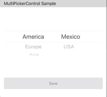
Working Sample
Wrapping Up
With that, we’ve successfully created our custom picker. You may have noticed that we didn’t make an equivalent control for Android; While there is no single control (to my knowledge) that we can segment in the same way we did for iOS, we might be able to render a series of spinners that react to changes in a similar fashion. That’s an exercise for a later date, however 😉
You can find the full working demo of this in my xamarin samples repo on GitHub.
 I Write Code Sometimes